"Sickly, sinful, spectacles stand, shuffle, shamble and saunter shamelessly in mine scandalized sight! I suggest a solution... Surely such sedition should sour and succumb to Sigvald - the salacious, scandalous and sensational servant of Slaanesh! Son of Succubi, scion of sordid acts and slayer of squalid serfs! See how I stroll, stride, swagger and swirl, spin, slash and stab at stupid, senseless scum! Soon they shall swoon, shall seek solace and death from sundry torments wrought on them by my strategic, severing, scintillating shower of shimmering strikes! Send for the sword - summon Sliverslash!"
-Prince Sigvald, addressing his warhost (from Total War:Warhammer)
I've had this model lying around since GW announced they were switching to finecast. I quickly picked him up while he was still in metal since I knew that sword would not do well in resin. Sigvald was very much an experimental model for me. For his face, I was inspired by a few different sources; namely the old 40k face tattoos from Rogue Trader, the novel Fulgrim, and Hollywood's depiction of French Fashion in the 18th century. From Fulgrim, I loved the idea that Slaanesh's worshipers overdue their appearance so I wanted a look of caked on makeup. I also gave him really pink, small painted lips like the French ladies in the aforementioned period movies. The face tattoo didn't quite come out the way I wanted to. Primarily it is not faded enough and, if you enlarge the picture you can see that it is uneven on the bottom.
Much like Ya'ng'w, I was wanting to play with gold armor. I pretty much followed the same formula, but I took the shadows way lower, going all the way to black. It was...too much I think. That said, he did lead me to figure out a better way and I will hopefully have photos of that before too long.
I also wanted to try upping my metallic game in other areas. Specifically, I wanted to try some sky-earth reflections on the shield and get the sword more accurate in it's shading and highlighting. Both of these came out better, with the sword being one of the better jobs I've done on a weapon.
The shield was done with an airbrush and the Scale 75 metallic browns and blues. For my first attempt, I am pretty happy with it. Obviously, there is a long way to go though.
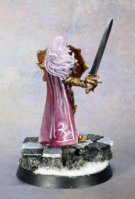
I had also wanted to try out a more elaborate base with him. I cut out a bunch of squares of plastic card and roughed up the edges then painted them to represent marble. Once the tile's base color was applied I "dragged" the brush with the highlight (for the black tiles) or the shade (for the white tiles) to represent the veins in the marble.
Finally, there is the cloak. I attempted to work on my blending and my freehand with the emblem. The emblem came out way too large and blending is not very smooth--but I have a problem getting good blends with magenta and that's why I am practicing it 😂


At first, not being at all familiar with this sculpt, I thought it was a Rackham effort. It certainly fits in with their style of sculpting and not the silly-proportioned GW alternatives.
ReplyDeleteThe sword and shield effects are far better than you give yourself credit for mate (Way better than I could attempt) and that gold effect is lovely.
Overall I really like this bloke. Especially his uneven smear across his eyes - a tattoo, self-done, is rarely WELL-done, so the unevenness really works for me - adds to the Chaos-infused insanity of his expression.
Thanks, I'm pretty happy with the sword effect and the attempt at the shield's mirror affect (recognizing that it was a first attempt).
DeleteI'm glad you like the unevenness, I'm to orderly to accept it...odd then that I'm painting chaos 😂
B... B... But it's truly spectacular!!
ReplyDelete😍
DeleteVery interesting model. I really like where you are taking things as you push your technique.
ReplyDeleteThanks!
DeleteReally like that face tattoo
ReplyDelete